An effective IPL team and its logo may build a feeling of community and an emotional bond with followers.
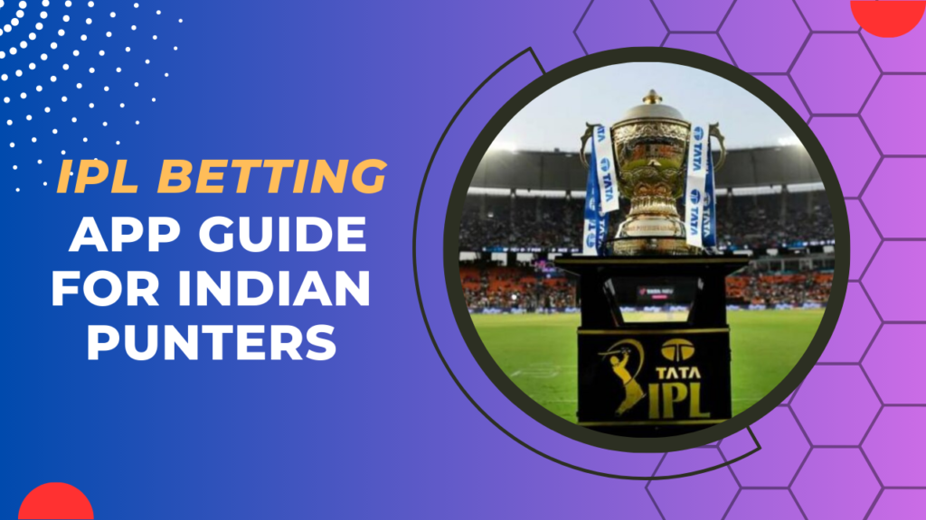
The IPL 2025 is coming soon and thus far, the competition has produced some thrilling matches. Ten teams are there to compete for the prize this year as well. It is difficult to pick a winner because every team has played well thus far. But if you root for a certain team, you presumably think they’ll win and take home the trophy. However, along with the team’s performances, fans are also emotionally connected to their IPL Team Logos and jerseys.
Being an IPL team ardent supporter is a difficult endeavor. Every year, teams make a few big roster changes. As a supporter, you must analyze these moves to see how the new players will affect the performance of your preferred team. Some teams aim to include creative ideas into their clothing and alter the jersey every season. However, the IPL team logos are usually not changed because they are an important part of a team’s identity that is seldom modified, much like the IPL Theme Music & Song.
An IPL team logo conveys a narrative that fans can relate to and comprehend; it’s more than just a mark for a franchise. An effective logo may build a feeling of community and an emotional bond with followers. An IPL team’s logo also has a big effect on item sales because supporters frequently wish to flaunt their team loyalty by donning apparel or accessories with the emblem.
Therefore, teams frequently devote a lot of time and money to creating and perfecting their logo to make sure that it truly captures the essence of the team and appeals to supporters, even to those involed in Online IPL Cricket Betting.
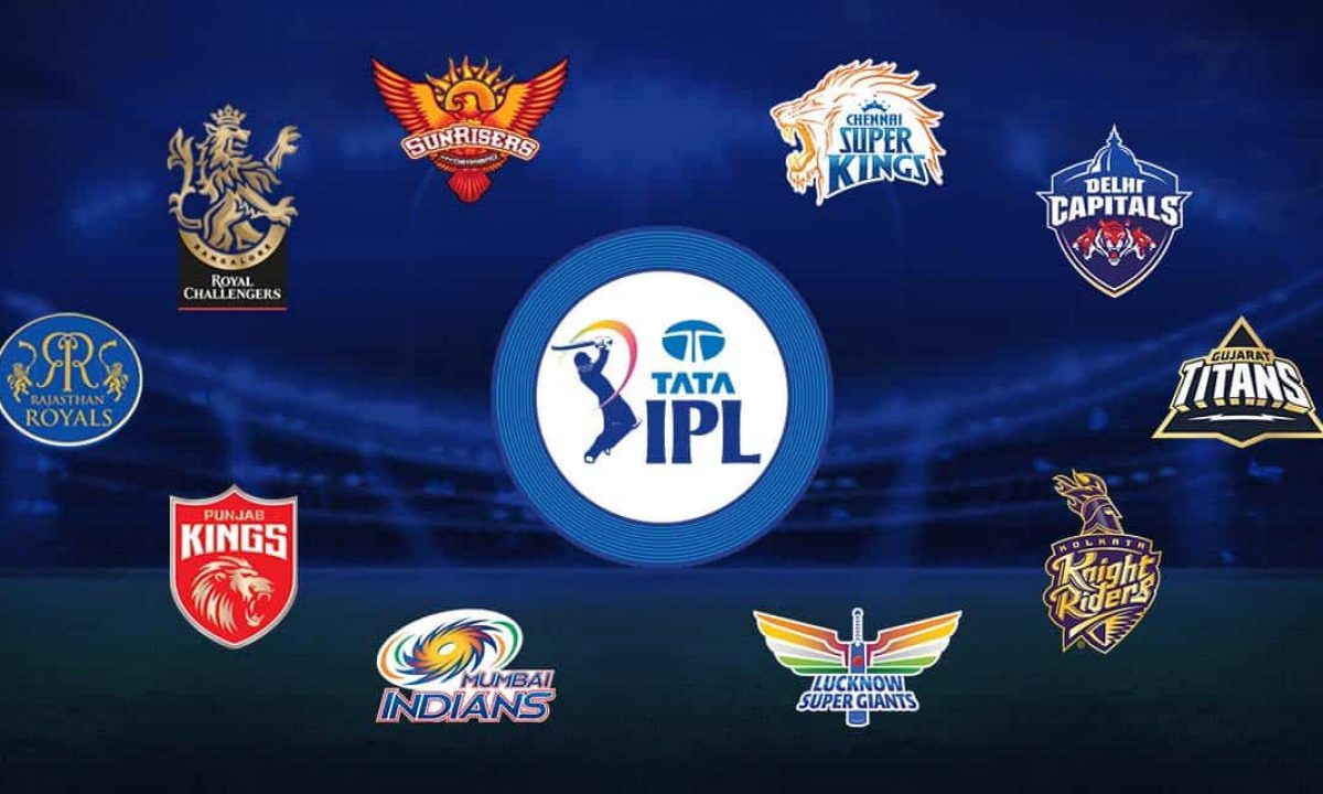
IPL Team Logos 2025
Ranking of the logos of all ten IPL teams this season
1. Lucknow Super Giants Unveil Team Logo (7/10)

A ball is carved in the center of the bat that appears in the Lucknow Super Giants’ emblem. The Indian Tricolour has served as an inspiration for the color of the bat’s wings, which are present on both sides. The wings’ design was influenced by the swift-striding legendary bird known as the Garuda. All Indian communities and subcultures have the garuda bird.
The ball is red with an orange seam, and the bat in the center is blue. The ball’s pattern is reminiscent of the lucky “jay tilak,” connected to good fortune in Indian households. The franchise’s appeal across India is symbolized by the tricolor in the wings. Indian mythology served as a major inspiration for the logo. Every component of the thoughtfully created logo has a deep significance. The Sanjeev Goenka-owned squad qualified for the playoffs in their inaugural season while sporting a uniform that was colored aquamarine blue. The emblem is still the same, but this IPL team’s jersey’s color is now dark blue for this season.
2. Gujarat Titans Unveil Team Logo (7.5/10)
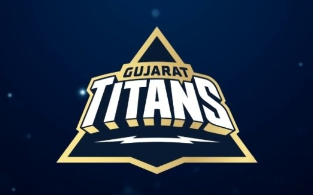
Under Hardik Pandya’s leadership, the Gujarat Titans, who made their debut the previous season, took home the trophy. Last year, the group revealed their logo in the metaverse. The emblem is modeled after a kite that soars into the sky, and the team’s success in finishing first in the first season is reflected in this as well. Gujarat’s cultural legacy includes kite flying, which is celebrated with events like Uttarayan during the state’s annual International Kite Festival. The team name is accompanied by a lightning bolt in the logo. This stands for the team’s enthusiasm and capacity to instantly brighten even the gloomiest skies. The same also represents the team’s will to persevere through adversity and triumph in the face of adversity. The team shirt also features this lightning bolt emblem.
The shirt has the same navy blue, gold, and white colors as the emblem. The logo’s design is quite basic and has a lot of room for improvement. Since the team is new to the IPL, it will take some time for fans to understand the importance of the logo. Although their shirt is regarded as one of the greatest in the game, its emblem may not make a compelling argument.
3. Mumbai Indians Team Logo (8/10)

In 2010, the Mumbai Indians made a few small adjustments to their logo, which is now in use. The Sudarshana Chakra, which the Hindu scriptures credit to the divinity Vishnu, served as a major inspiration for the logo. The team has won the trophy five times and is well-known for its reliable performances in the competition. Their logo design maintains the original concept and color scheme in the same way.
The team’s initial logo was designed in 2008. The Chakra symbol was placed above the franchise name in the original logo. The colors of the Chakra were blue and yellow-to-red, with a white outline and blue and red lettering. Two orange and green strokes were employed to depict the Indian flag on the left side of the design. 2010 saw a little tweak to the logo, along with a more sophisticated color scheme. In contrast to the original logo, the Chakra was rotated in the other direction. The Chakra’s pointed blades were oriented to the left in the original design, but they are now swirling to the right in the updated version. The redesigned logo features the orange and green strokes on both sides, which were previously limited to one side of the Chakra.
Read about – Mumbai Indians IPL 2025 Players List- Names, Price and Captains Details
4.) Rajasthan Royals Team Logo (8/10)

Under the legendary Shane Warne, the Rajasthan Royals made history as they emerged victorious in the tournament’s first year. The logo used gold and blue for their first season. The lion known as Moochu Singh, the team’s mascot, appeared on both sides of the emblem. There were two reversed Rs in the center, with a crown on top.
They altered their logo in 2009, changing the predominant color to blue and lowering the quantity of gold. The only elements in gold were the two Rs, the team name, and the mascot. The squad utilized the same logo in 2018 when they made their tournament comeback following a two-year suspension. In 2019, the Rajasthan Royals completely changed their emblem, saying goodbye to their previous color scheme and introducing a new pink design. The mascot was eliminated, but the crown from the team’s original emblem was reinstated. Jaipur’s renown as “Pink City” justified the updated logo. Additionally, the color was employed to raise cancer awareness.
5.) Punjab Kings Team Logo (8/10)
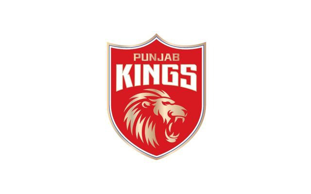
Before the 2021 Indian Premier League season, the team was known as Kings XI Punjab until rebranding as Punjab Kings. The team has continuously used the colors red and white in their emblem, with the addition of gold later on, even after changing their name. The current logo of the team is based on the primary logo, which was inspired by a shield.
The current logo has a single lion picture in place of the previous one, which had two lion heads looking in opposite directions. In the middle of the logo, set against a solid red background, is the golden lion. The name of the franchise is now displayed in two lines in the top portion of the emblem. Gold and white are utilized together with a variety of other styles and colors to engrave the name.
The Punjab-based team named Shikhar Dhawan as their captain for the current campaign, and they defeated the Kolkata Knight Riders seven runs to none in the first meeting. Thanks to a half-century from Bhanuka Rajapaksa, they managed to score 191 runs at five wickets down. Arshdeep Singh was declared Player of the Match after taking three wickets for 19 runs in three overs. With a new captain leading them, the Kings will be looking to break their record of never having won the championship.
6.) Delhi Capitals Team Logo (8.5/10)
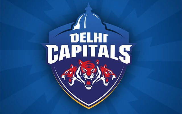
Up until the 2018 season, the Delhi-based team was known as the Delhi Daredevils. Delhi Capitals was the new name that was adopted in December 2018. Delhi is the capital and the center of power for the nation, which is why the name was changed. Because the team wanted to be the hub of the league’s action, the term “Caps” was added to the moniker.
In contrast to Punjab Kings, the team had numerous alterations as a result of the name change. The primary color of the previous emblem, red, was changed to blue. The three tigers in the logo’s center are an amalgam of two national emblems. India’s national animal is the tiger, and its national emblem is the Lion Capital of Ashoka, which features four lions in total—only three of which are visible from the front. The top portion of the logo features a dome-shaped structure that was modeled after the New Delhi, India-based Parliament of India.
In the previous four seasons, the Capitals have made three trips to the postseason. They lost the tournament final to the Mumbai Indians and finished as the runner-up in the 2020 season. Since Rishabh Pant is not allowed to play in the event, David Warner has been chosen as the team’s captain this year. The Indian all-rounder Axar Patel has been elevated to vice-captain.
7.) Sunrisers Hyderabad IPL Team Logo (8.5/10)
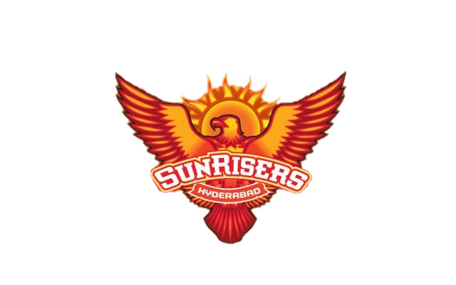
The Hyderabad-based franchise made its IPL debut in 2013 and went on to clinch the trophy in 2016. In their ten appearances in the tournament so far, SRH has qualified for the playoffs six times and reached the final twice. Last year, they finished in 10th place with 4 wins in 14 games. This season, they have named Aiden Markram, the captain, and Brian Lara, the head coach. The primary colors of the franchise’s logo are orange and yellow. The logo is a powerful representation of the team’s bold and aspirational nature. One of the most beautiful and powerful birds, the eagle, is depicted in it against the backdrop of the rising sun. It suggests that, like an eagle soaring over the skies, the team is prepared to take off and soar to new heights of accomplishment.
The Indian Premier League is very competitive, and Eagle is a representation of strength, speed, and ferocious determination—qualities that are necessary for success. An additional level of meaning is added by the rising sun in the background, which stands for a new day and a fresh start for the group. The sun and eagle combine to provide a striking and dynamic graphic that captures the team’s will to succeed and battling mentality. The team’s goals and dedication to excellence are reflected in the logo, which is a strong and motivating image.
8.) Royal Challengers Bangalore IPL Team Logo (9/10)

The Royal Challengers Bangalore utilized a circular logo for their first seven years in the IPL when they initially entered the competition in 2008. A massive crown adorned in red, gold, and silver was perched atop. The letter “RC” was written in the middle and occupied a large portion of the page. Around the emblem, on a golden frame, was also written the franchise’s name in black.
The franchise modified the logo in 2016 to give it a more contemporary appearance by shrinking the letter “RC.” The majority of the logo’s color scheme was black. At the top of the logo, a golden lion with a black outline took the place of the crown. On the golden frame of the logo, the franchise name was once more written in the same typeface and size.
The franchise abandoned the circular design in 2020 and revealed a new one. Greater than the lion in the previous logo, the new logo has a light gold lion at the top. Beneath the lion, the word “Bangalore” is inscribed individually in black at the top. At the base of the logo, “Royal Challengers” is written in white on two layers, with a red underline. The new logo combines the colors red, black, white, and gold in a sleeker, more contemporary style.
9) Chennai Super Kings Team Logo (9/10)
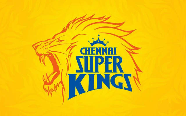
One of the most recognizable logos in Indian Premier League history belongs to the Chennai Super Kings. The logo has been in use since the tournament’s inception and has not undergone any notable alterations. The fierce, roaring lion in CSK’s emblem represents the team’s fortitude, bravery, and steadfast will to win every match. The blue name of the team has a crown on top of it.
The primary color of the CSK logo, yellow, gives the company a feeling of warmth and vitality. It also gives both the players and the spectators a sense of hope and optimism. The CSK logo embodies the team’s fiery attitude and unwavering quest for perfection in the game of cricket, whether it is through the fearsome lion or the eye-catching shade of yellow. The Chennai Super Kings have made a name for themselves in the Indian Premier League as one of the dominant powers, much like the formidable lion that rules the jungle.
Also,check – Chennai Super Kings IPL 2025 Players List With The Complete Price
10.) Kolkata Knight Riders IPL Logo (9.5/10)
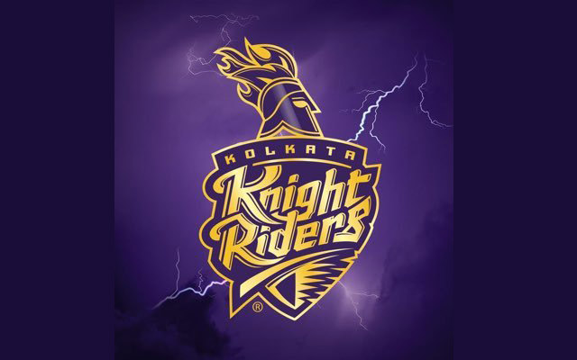
With one of the most iconic logos ever, the Kolkata Knight Riders are the third-most successful franchise in IPL history. The franchise debuted an iconic Viking helmet in 2008, and that same helmet was used in the logo. In the original design, the name was written in gold next to a blazing helmet on a black background. 2010 saw the color purple take the place of black.
In 2012, the current logo was created. A Corinthian helmet took the place of the Viking one. The purple and gold color scheme was carefully considered and purposefully chosen. Gold is a symbol of the team’s strength, power, and vitality, while purple has traditionally been connected to royalty.
As a result of the franchise’s success in the Indian Premier League (IPL), the logo has taken on legendary status. It is enthusiastically worn by supporters and fans alike on everything from team jerseys and products to the streets of Kolkata during the Indian Premier League season.
The KKR logo, which is among the most identifiable in the IPL, is now a point of pride for both players and fans, even those involved in T20 Betting.
It serves as a continual reminder of the group’s history and its steadfast dedication to greatness on and off the pitch.
IPL Teams and their Logos Frequently Asked Questions (FAQs)
1) Which team adopted different jerseys for home and away matches in IPL 2016?
Royal Challengers Bangalore.
2) Which team’s jersey is yellow?
Chennai Super Kings.
3) Which team is known as the Orange Army in the IPL?
Sunrisers Hyderabad. For more IPL-related information, you can check on Orange Cap in IPL.